I know we have said this a million times but EMAIL MARKETING IS NOT DEAD! It isn’t even on its last leg. Believe me, it is alive and well, but it takes an understanding of how people engage emails to know how to make your messaging effective. Here are three tips that when followed will surely boost your Mailchimp open rate.
I recently crafted an email campaign that was sent to 4,055 people and boasts a 51% open rate, with a 3.8% click rate: which means 2,041 people saw the message and that it practically doubled every industry average.

1. Send the email from a person, NOT a company.
We have all been the person who deletes an email without even opening it or ignores it because we have 30 other emails that seem more important than a company update. To make sure that your email doesn’t get pushed to the trash, send from a person’s name rather than your company name. The campaign is personable that way and will be opened more. Here is an example. Instead of sending from “The National Monuments Foundation,” it is sent from “Elizabeth Warland.”
![]() 2. Use an engaging title and header!
2. Use an engaging title and header!
I used a question. People want to answer questions, which makes them click in.
![]()
Of course, it took me a few edits to get to that point.
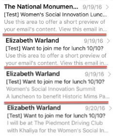 My first test email was awful. The sender and subject were impersonal, cold, and unengaging. I didn’t even include a header. What was I thinking?
It was slightly better in the second draft: the sender and subject are captivating, but the header still isn’t filled in.
The third finally has a header! but it is weak. I definitely needed to fix that.
The fourth gets the job done! It is personal, informative, and makes you want to open it!
3. Make sure it is mobile friendly
When it comes to increasing your Mailchimp open rate, much of the battle is making the message appear well in mobile. For example, 62.5% of people will open this email using a mobile device, and 56% of that group is reading using an iPhone.

So use the preview function to see what the campaign will look like on a mobile device because you don’t want someone bouncing before reading the content.
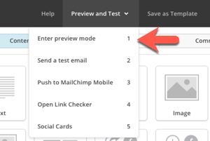
You will most likely have to tweak a few things or resize pictures when seeing the campaign in preview mode. 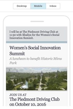 Here is the final draft in mobile preview. All of the important information is at the top, and the message is short sweet and to the point because let’s face it, people are less likely to scroll through an email if it is super long.
What is my new goal? Increasing click rate to 5%!
